Hello Doc/Editor,
Excellent mag with a noticeable lack of hyperbole (aka BS).
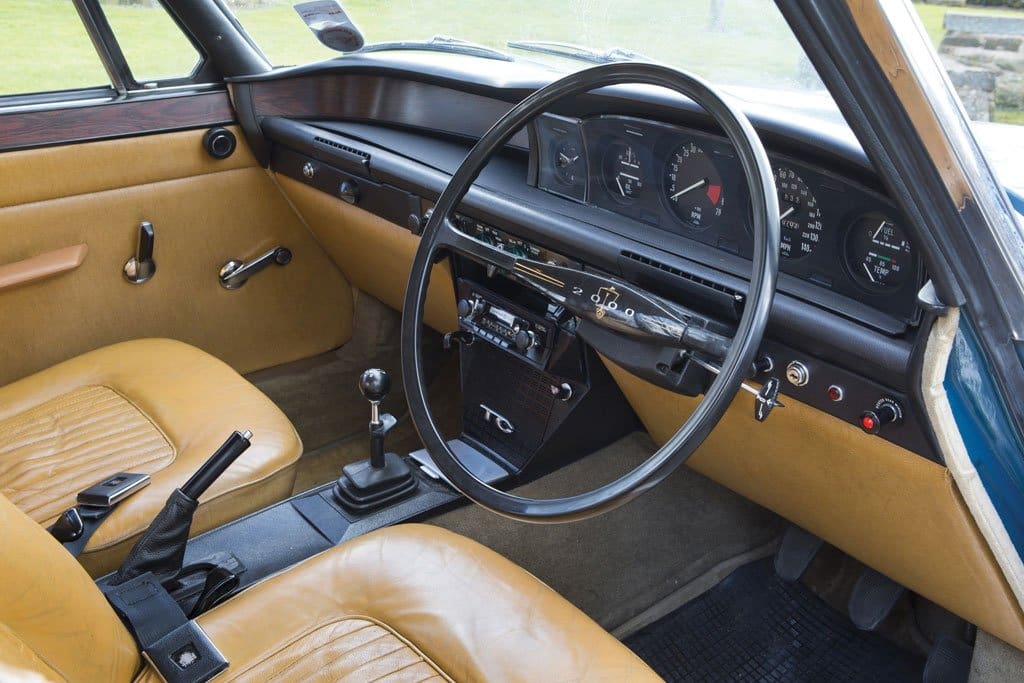
I have been following the various bits of correspondence about touchscreens in cars. I am not a fan and trying to remember the approximate position of the relevant heater button is not conducive to safe driving. I thought that I would add something from the depths of my memory: the advertising blurb for the Rover 2000 boasted that every switch or lever that had a different function had a different shape.
New car manufacturers should take note!
Me? I’m swanning around in a Skoda Superb.
Walter
Hello Walter,
Brilliant. I think it’s time our esteemed editor dished out awards for the best letter/email received at Doctor Diesel towers, because you make an excellent point about the Rover 2000. David Bache was responsible for the interior styling, and he delivered a masterclass in ergonomics and common sense. As you say, the toggle switches were of different designs to make them easier to distinguish in the dark. Crucially, you could use them without taking your eyes off the road. The speedometer was positioned as far from the driver’s eyes as possible to make it easier to switch focus from the road to the dials. The cold air vents were positioned to prevent drowsiness, while so-called ‘idiot lights’ were used instead of gauges because they were impossible to ignore. Just a few examples of why the Rover 2000 was a worthy winner of the inaugural European Car of the Year award in 1964.
Enjoy your Superb and thanks for the superb memories.
Best regards,
Doc
© Motorworld Media 2023
Registered Office: 4 Capricorn Centre, Cranes Farm Road, Basildon, Essex. SS14 3JJ
Company Number: 8818356
Website designed by Steve Dawson